At Helmes Design, we strongly believe in solutions that bring value to our users, and through that, to our clients. To create that value, we need to understand, discover and validate the ideas, thoughts, problems, and challenges we’re facing. That’s done by our process called “the brain” – it’s a design thinking principle that helps us work effectively and efficiently, using different tools under our so-called magical (spoiler: it’s not) “design tool belt”.
For us, one of the most crucial parts in every project is called the “audit”. For us, a design audit means going into the company for a day or two and doing interviews, observing people and processes, and mapping out as much information we can (we leave some homework behind as well).
I imagine all the marketing people have heard about the “brand awareness gap”, but a summary definition would state that it’s the difference between what your brand is and what people perceive it to be. The same thing applies in design work. So I came up with a concept called the “design awareness gap”. The notion behind this is for us to focus on the implementation, usage and “quality” of design in its different aspects, channels, touchpoints, and so forth. Yes, our tool can be quite subjective, but it gives us an overview of how our clients think they use design in their organisation versus how their customers perceive it. So here comes the official definition (so far):
“The design awareness gap shows the difference between end-user expectations of services/products versus what the companies think they are offering”
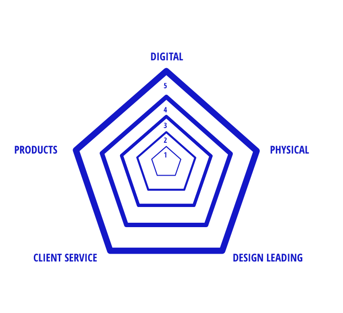
And it’s easy to use; anyone can do it. With the company, it’s done during a workshop or an interview (can be one-on-one) where the client is asked to evaluate five pillars or corners of their company from the design perspective. The five pillars/corners are:
- digital channels,
- physical channels,
- design leading (design-driven management/decisions),
- client service,
- and production (or a product).
The map for the pillars is drawn out as a polygon (aka “the spider”).
The process should go as follows: everyone fills in the spider according to personal feelings – how do I perceive the company – 1 is the lowest grade and 5 is the best grade.
When the client has filled out its point of view, it is time to look at what the end-users think, with users focused on different segments. We mainly do it with two or three persons per segment to avoid what we called the saturation effect (come to coffee, and we’ll talk about it more!). When both the client and the end-users have filled out our “spider” during an interview or a workshop, you can compare them and see if the focus of “design” efforts at the company is noted by its end-users or not.
So here you go – a light, easy to use and quickly understandable design tool. Use it often, use it everywhere … just use it.
And if you want to know more about our design team and their doings feel free to contact our head of design, Mikk Tasa (mikk.tasa@helmes.com) or our team manager, Rait Matiisen (rait.matiisen@helmes.com).
P.S.: We sometimes do free design audits, so remember to contact us.