

Clarity through data: business intelligence & analytics services
From data strategy and engineering to dashboards, reporting, and support, we help companies turn complex data into reliable insight for more data-driven decision-making.

Make confident decisions with the right data foundation
Unlock the full potential of your data with Helmes’ Data engineering and Business Intelligence services. With over 60 experts across the Baltics and Poland, we deliver scalable, maintainable solutions that turn fragmented data into reliable reporting and practical business insight.
Our services

Data strategy & governance
Lay the groundwork for long-term success with strategic advisory, practical planning, and enablement services that help you manage data the right way.

Data platforms & engineering
Have the right infrastructure for all of your data. Whether you’re in the cloud, on-prem, or hybrid, we make sure your setup is fast, reliable, and decision-ready.

BI & Analytics delivery
Bring clarity to decisions through visualization and insight. From descriptive analytics to operational dashboards and data products, we help you create reporting that’s accurate, scalable, and aligned with your business logic.


Trusted platforms & partners
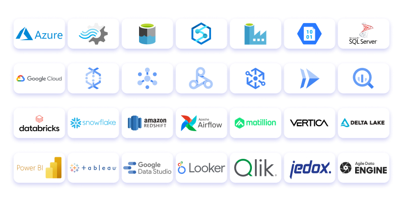
We work with a wide range of trusted technologies to build BI solutions that are scalable, maintainable, and tailored to your setup. Whether you’re working in Microsoft, Google, or multi-cloud environments, we choose the right tools for your needs – with a focus on reliability, performance, and long-term value.
Certified expertise in:
- Microsoft Solutions Partner – Data & AI (Azure)
- Databricks Certified Consulting Partner
- Qlik Certified Partner
- Jedox
- Agile Data Engine (ADE) Implementation Partner
Data strategy & governance
Data strategy
Data audit
Master data management & integration
Data platforms & engineering
Cloud data engineering and data warehousing
We design and build modern data platforms that serve as a single, trusted source for analytics and beyond. From architecture and integration to pipeline automation and monitoring, we manage the full lifecycle with deep expertise in Azure, AWS, and Google Cloud. Whether you’re using established platforms like Vertica or modern solutions like Snowflake and Databricks, we help you build scalable, maintainable big data warehouses that keep your data and dashboards always up to date – without manual effort.
Built for scale and complexity
Our high-throughput platforms are built for scale, processing billions of rows efficiently and enabling real-time analytics – especially in industries like telecom, fintech, and media where speed, reliability, and volume go hand in hand.
BI & Analytics Delivery
BI & data analytics / descriptive analytics
Turn raw data into insights your team can use. Whether it’s daily performance or big-picture trends, we help you replace fragmented spreadsheets with dashboards tailored to your roles, metrics, and workflows – and deliver clear visualizations that help you keep track of what matters.
Monitoring & support
Keep your wider data environment running reliably. Our Monitoring Center keeps an eye on performance and spots issues early – so problems get fixed before they disrupt your work. And if something does come up, support is always close: by phone or email, with response times you can count on.
Data products
As part of our commitment to value-driven delivery, we also provide quality data products that help teams work with insights right out of the box. These tools support daily work as well as long-term planning – with a focus on clarity, usability, and trust in the numbers.
- Jedox – an Excel-like platform for financial planning and forecasting. Jedox works well on its own or integrated with BI tools like Qlik to support performance management across the organization.
- RoiBot – a standardized Power BI module that connects to your data in 3-4 weeks. It comes with continuous monitoring to keep the data clean and includes Microsoft Azure cloud licensing.
- RoiBot Finance – Financial analysis, budgeting, and forecasting from the general ledger
- RoiBot Sales – Sales KPIs and forecasting based on sales ledger data

The BI & analytics lifecycle
Business intelligence isn’t just about building dashboards – it’s about creating reliable, sustainable systems that help people make better decisions every day. We support you throughout the entire lifecycle – from your first ideas and data audits to long-term support and continuous improvement. Whether you’re starting from scratch or refining an existing setup, we can jump in at any stage or guide you through the full journey.
We follow an agile, outcome-focused approach, using proven practices to make sure your solution is scalable, maintainable, and aligned with your business goals.

Ideation
- BI consultation and discovery workshops
- Business & data landscape review
- KPI and reporting strategy
- Prioritization of use cases and data domains
Development
- Data warehouse and model design
- ETL/ELT pipeline development
- Dashboard creation in Power BI, Tableau, Qlik etc.
- KPI logic and metric tracking
Operate and monitor
- Monitoring and performance tuning
- User onboarding and self-service enablement
- Support and governance setup
- Iterative updates based on feedback and business changes
Our full technology expertise

- Analytics & visualization tools
Power BI · Tableau · Looker · Google Data Studio · Qlik - Cloud data platforms & warehousing
Azure Synapse · Snowflake · BigQuery · Amazon Redshift · Databricks - Data engineering & workflow tools
Apache Airflow · SSIS · Azure Data Factory - Languages & scripting
SQL · Python - Common integrations
SAP · Salesforce · Microsoft Dynamics · REST APIs · CSV / Excel-based workflows - Certified expertise
- Microsoft Solutions Partner – Data & AI (Azure)
- Certified Databricks Consulting Partner
- Qlik Certified Partner (Qlik Sense Business Analyst Certification, Qlik Sense Data Architect Certification, Qlik Sense System Administrator Certification, Qlik Sales Accreditation and Technical Sales Accreditation)
- Jedox
It’s not just what we do – it’s how we work
We focus on getting things done in a way that’s efficient, reliable, and makes sense for your team. At Helmes, we’ve built teams that have worked together for years – people who know the tools, the process, and each other. Because of that, we’re able to deliver real productivity. And that means time and cost savings for you.